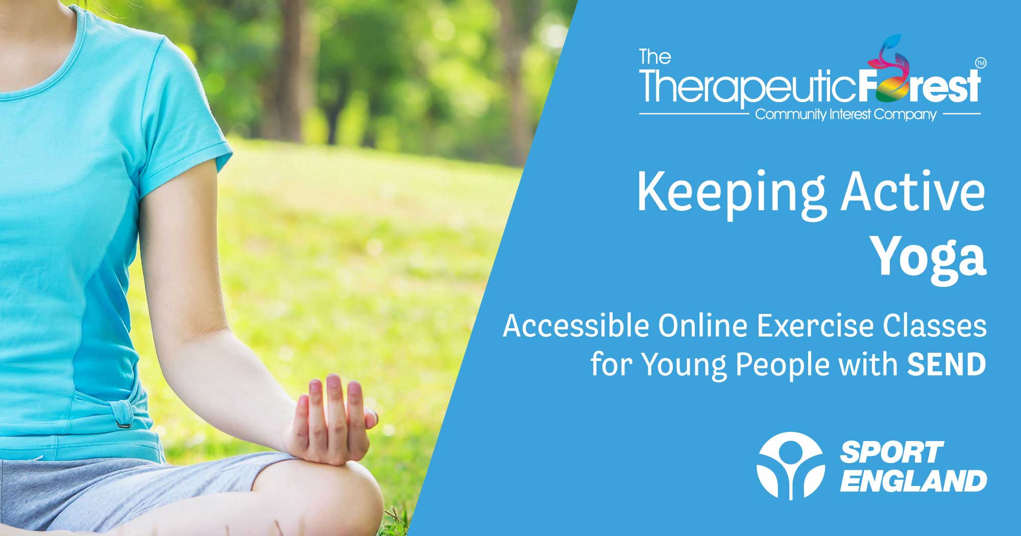
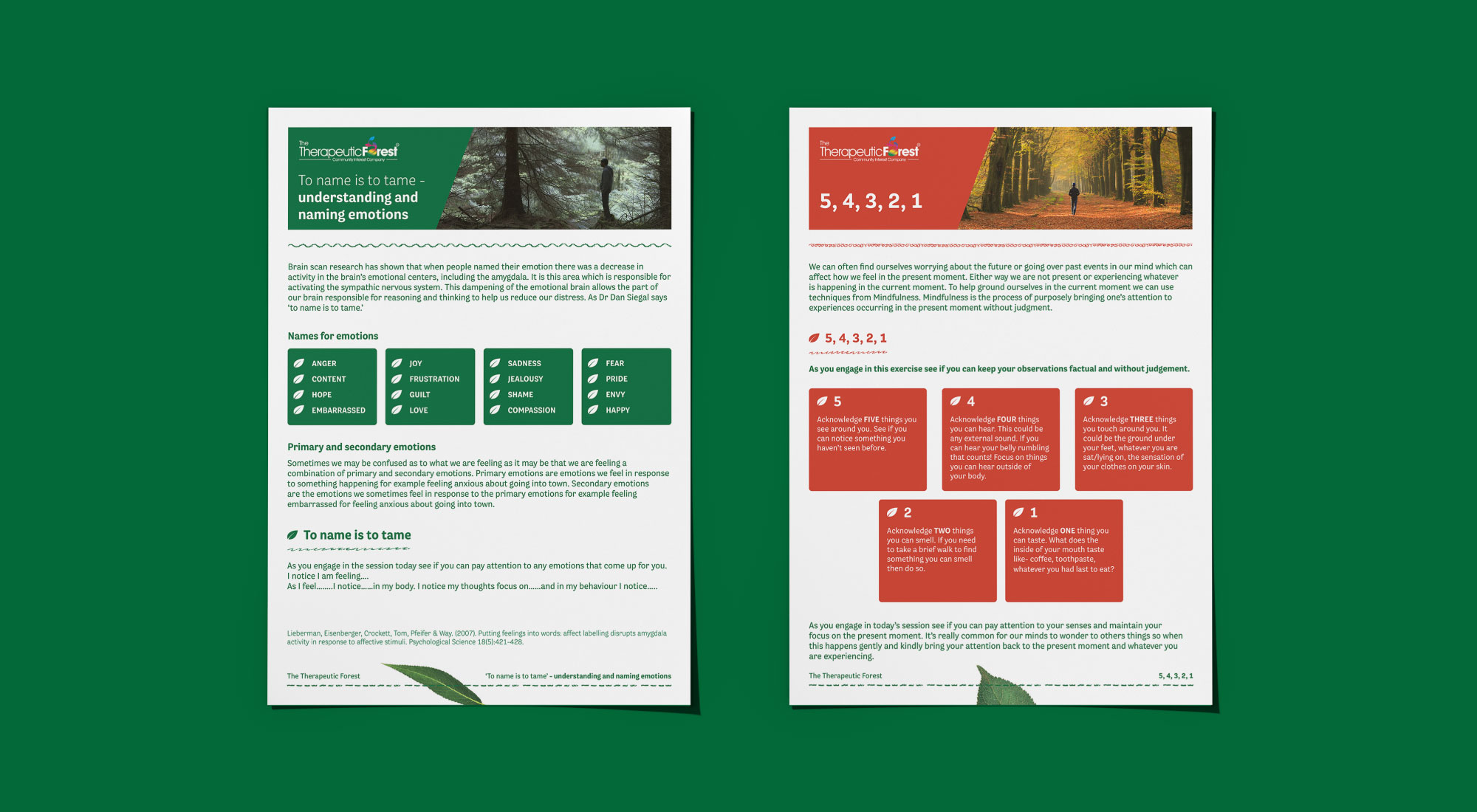
Taking inspiration from the outdoors, we created a colour palette that would capture the beauty of nature and reflect the companies values. Selecting a complementary colour palette of green, dark and light blue and brown that would allow a variation across application.
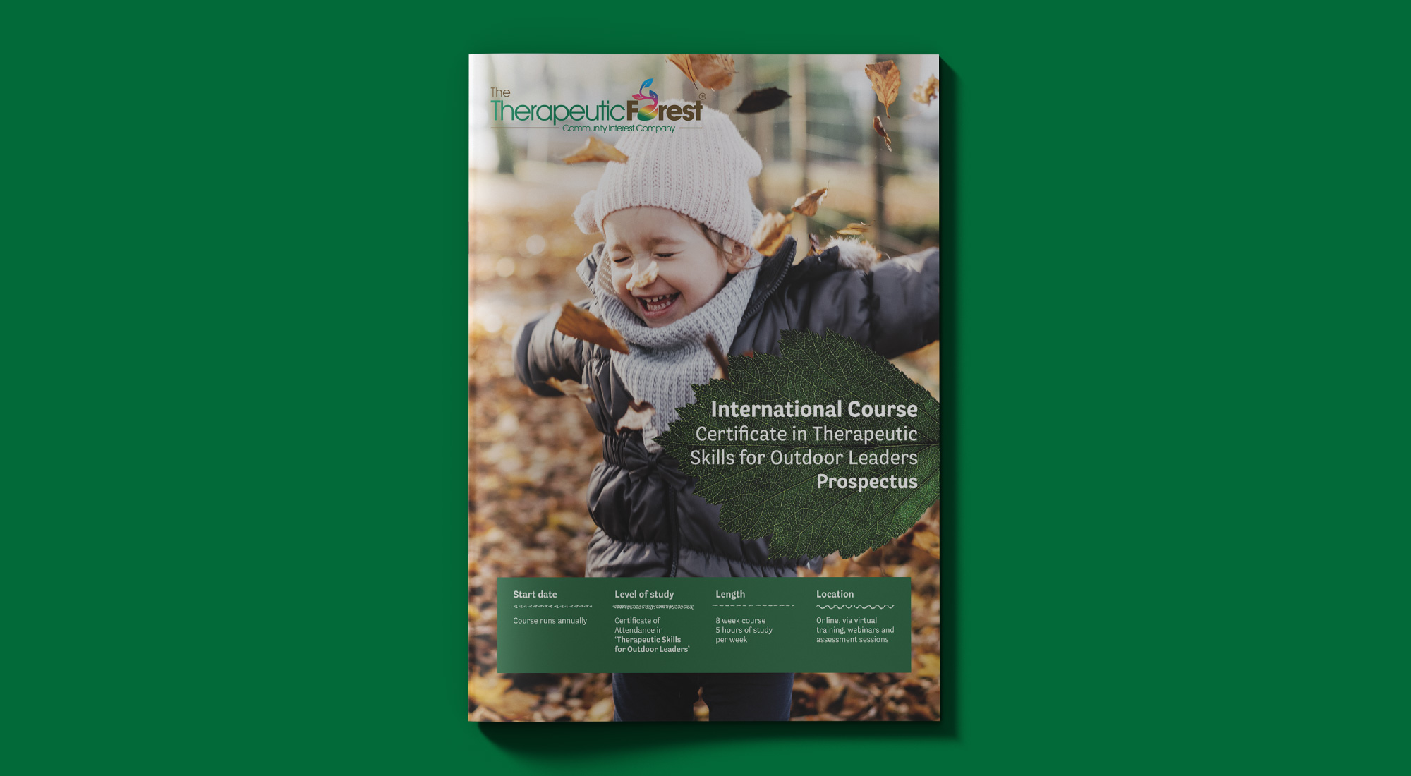
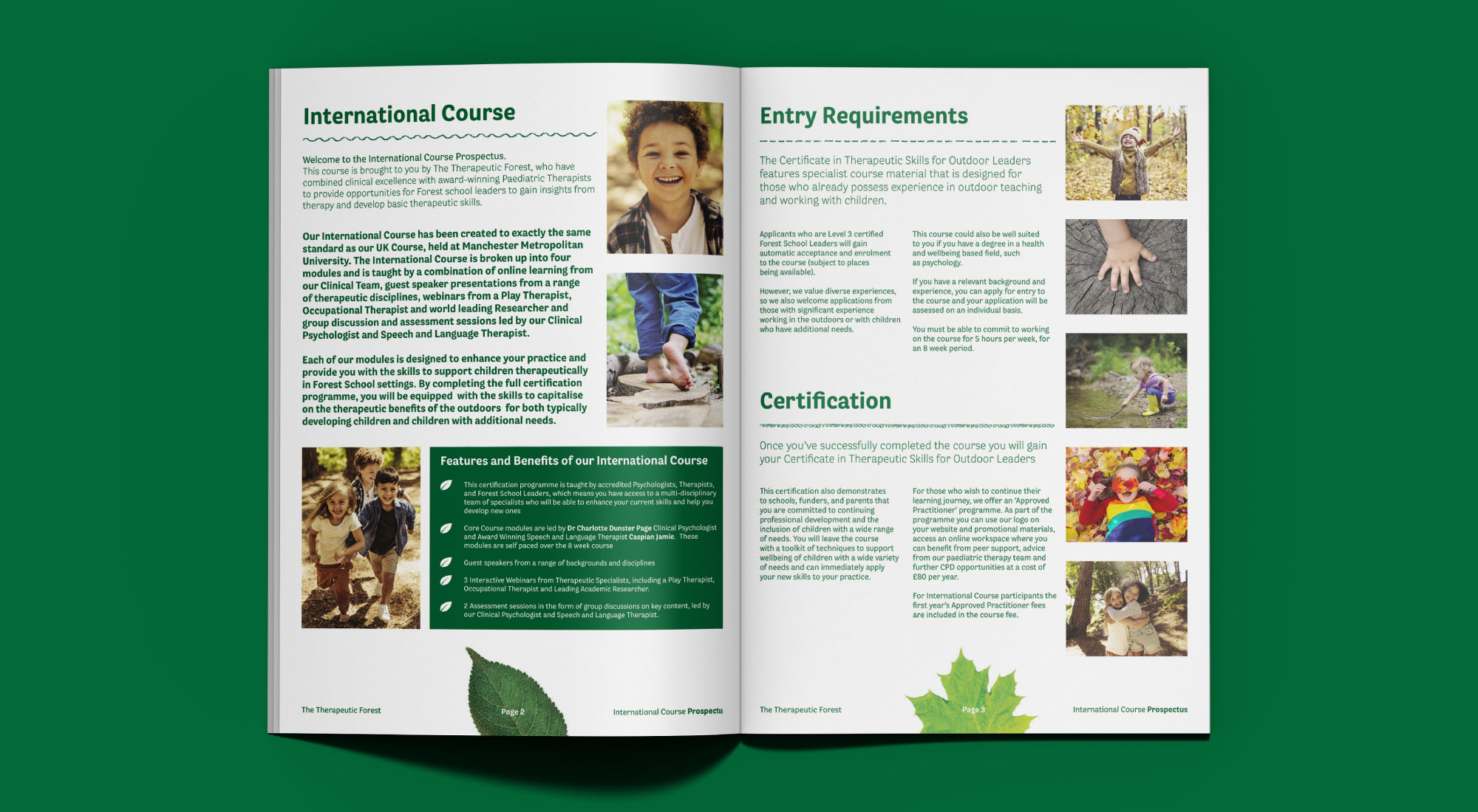
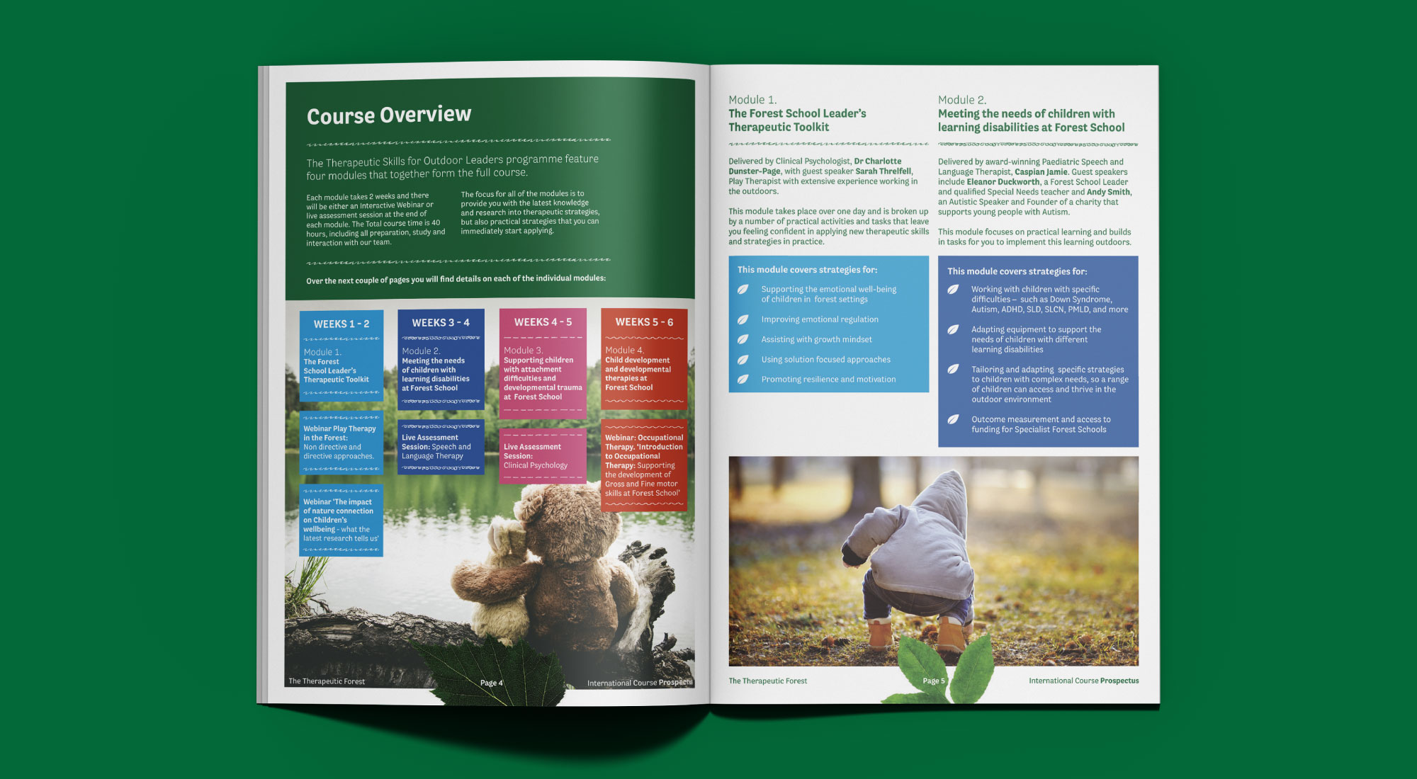
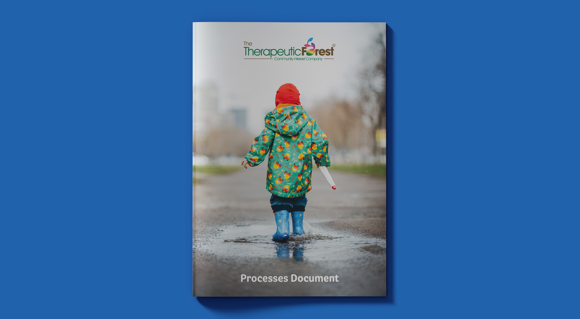
Selecting stock imagery that would reflect their offerings
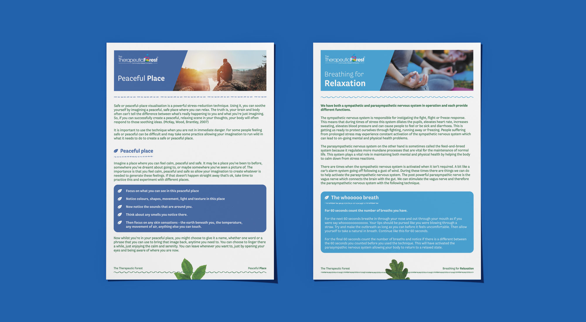
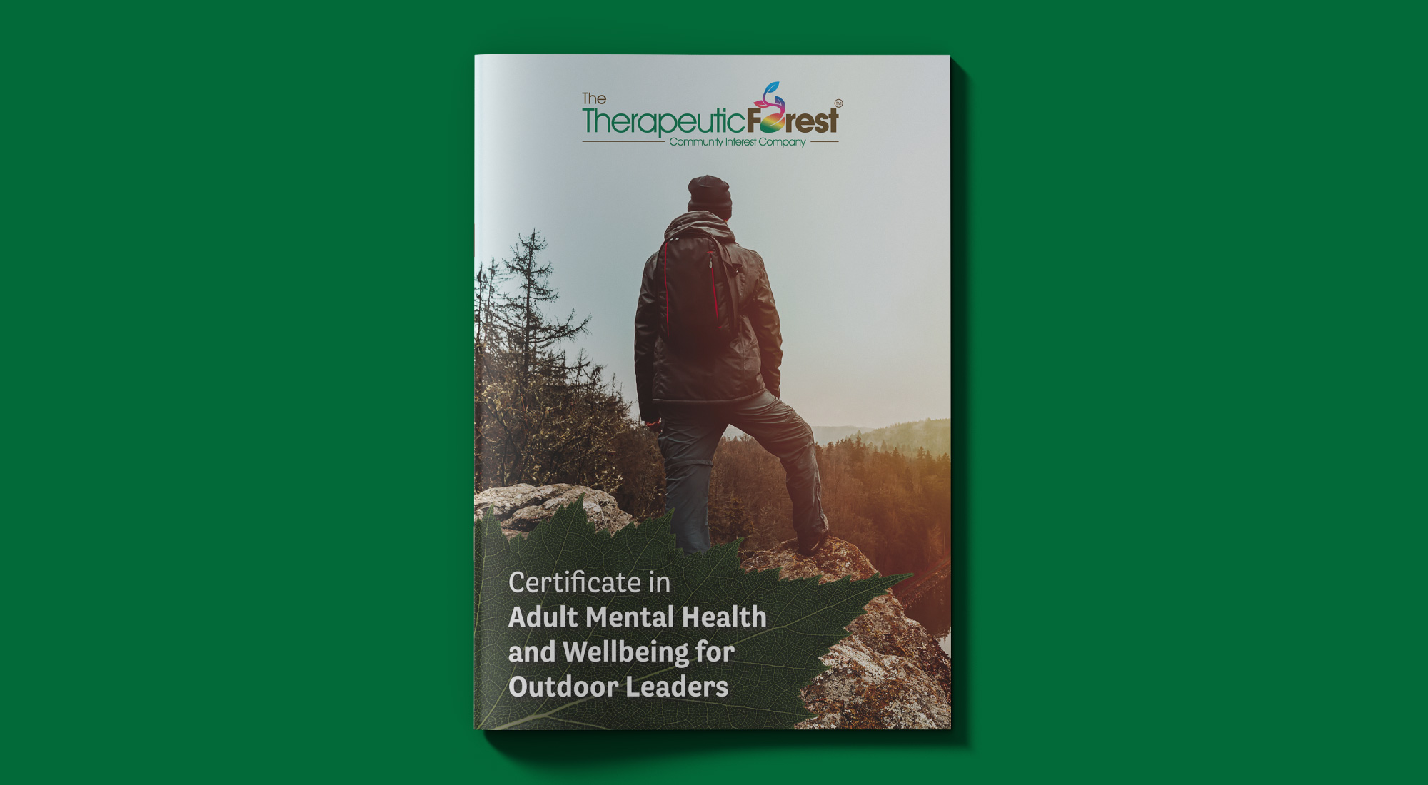
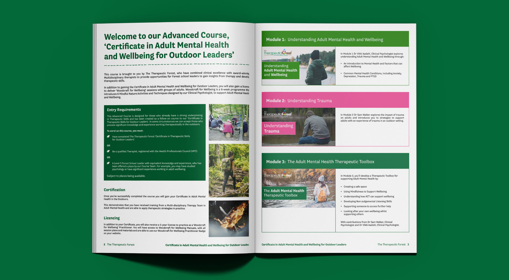
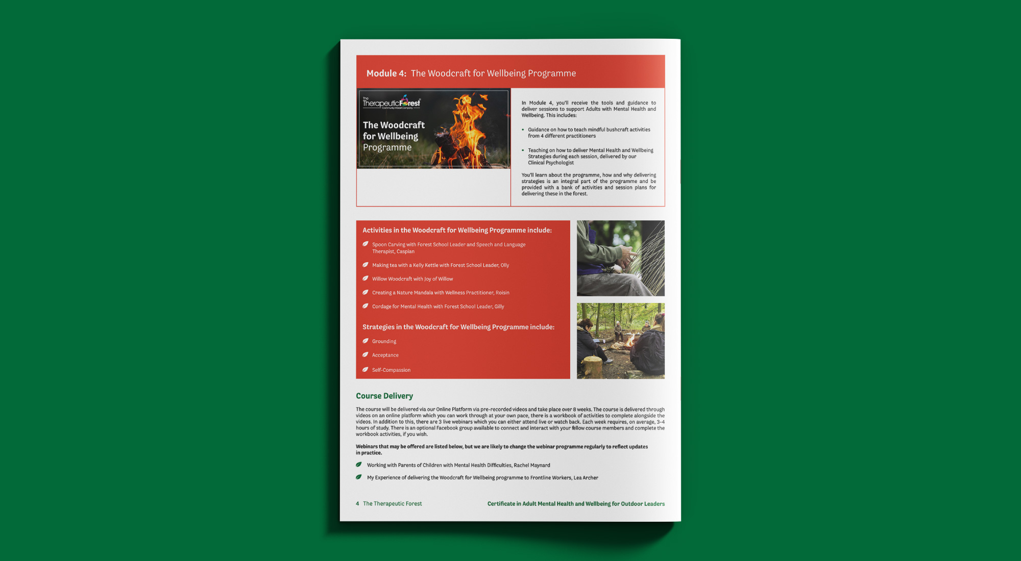
Meticulous thought was taken on choosing stock imagery that would pair well with the photos taken at live outdoor sessions. We chose a new sans serif typeface that would be easy to read and give a contemporary feel.
Looking to make sure the typeface would complement the logo. The brand would then work cohesively across both print and digital touch points.
We are a graphic design studio based in Huddersfield, West Yorkshire that specialises in print design. Please feel free to get in touch via our contact page. We’d love to hear about your business and are always happy to help.