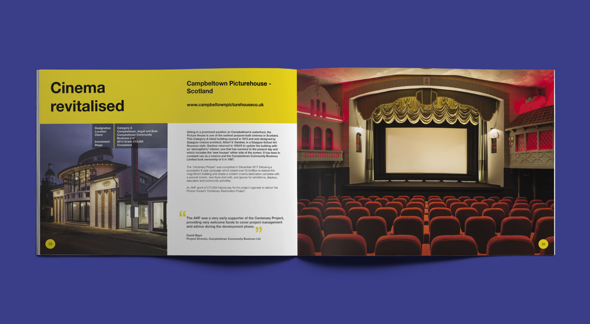
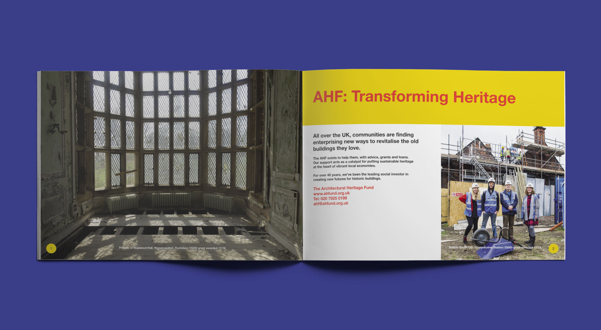
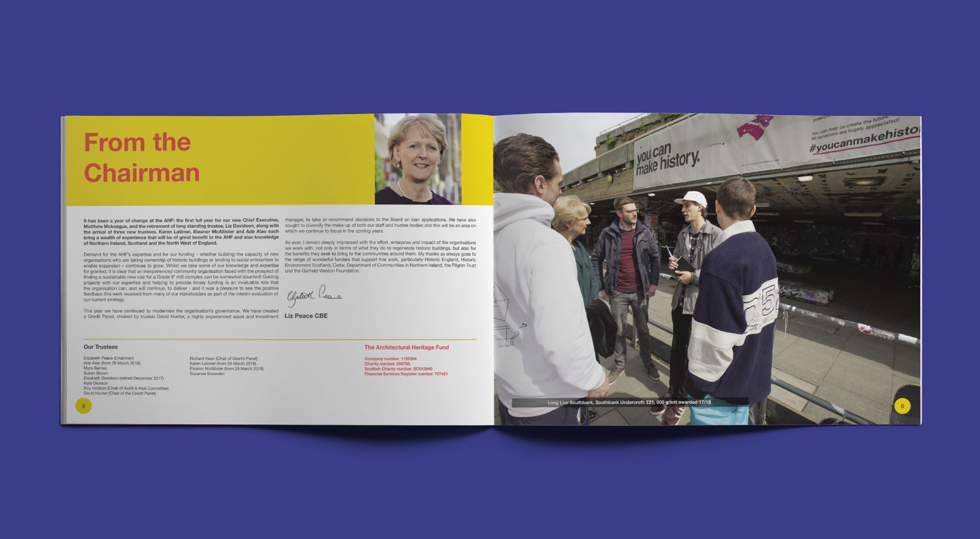
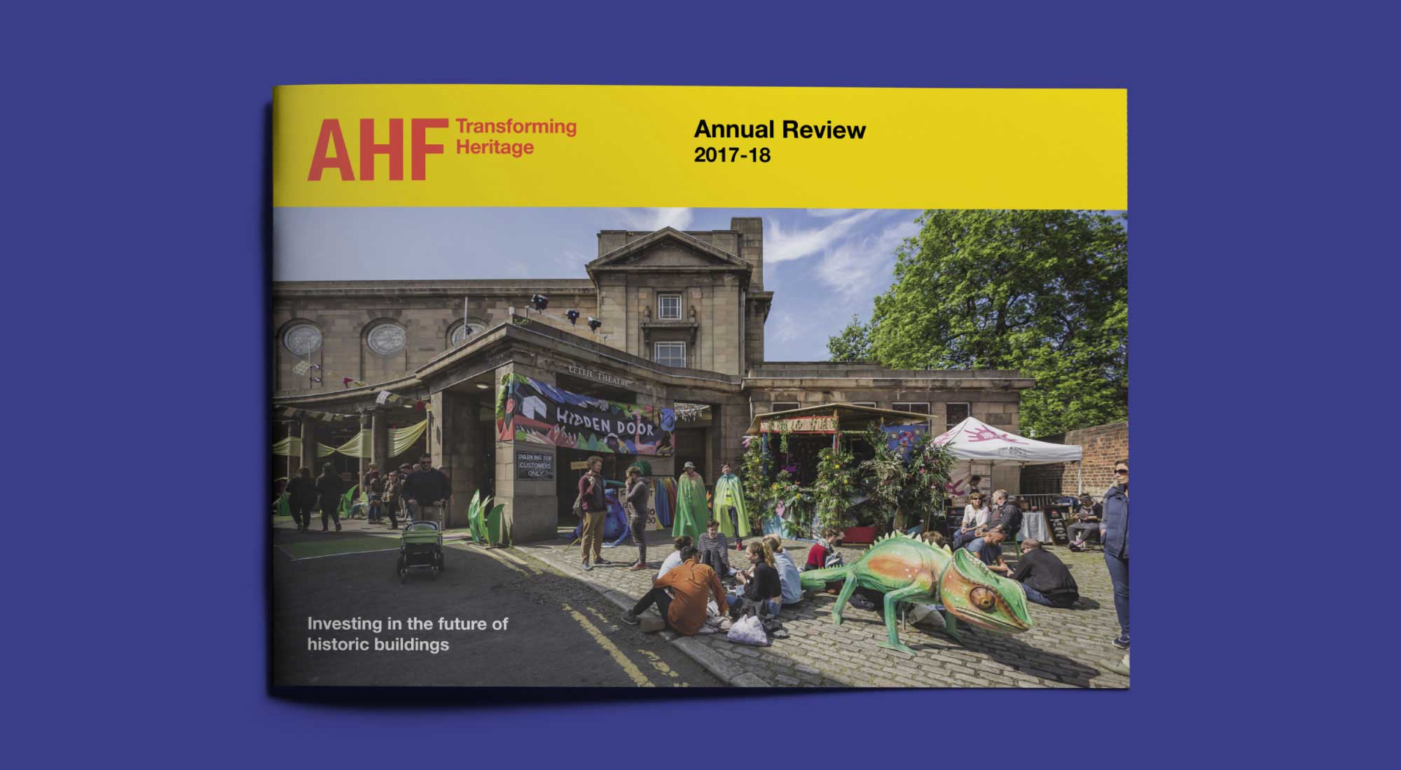
Tasked with creating the annual report design, we kicked the project off by researching the AHF. Looking into who they are, their strategic aims and what the brands core values are. We were provided with the existing brand logo, colour palette and the brand visual guidelines document to follow. Additionally, the previous year’s review was given to us for a point of reference.
Selecting a typeface that matches their brand logo
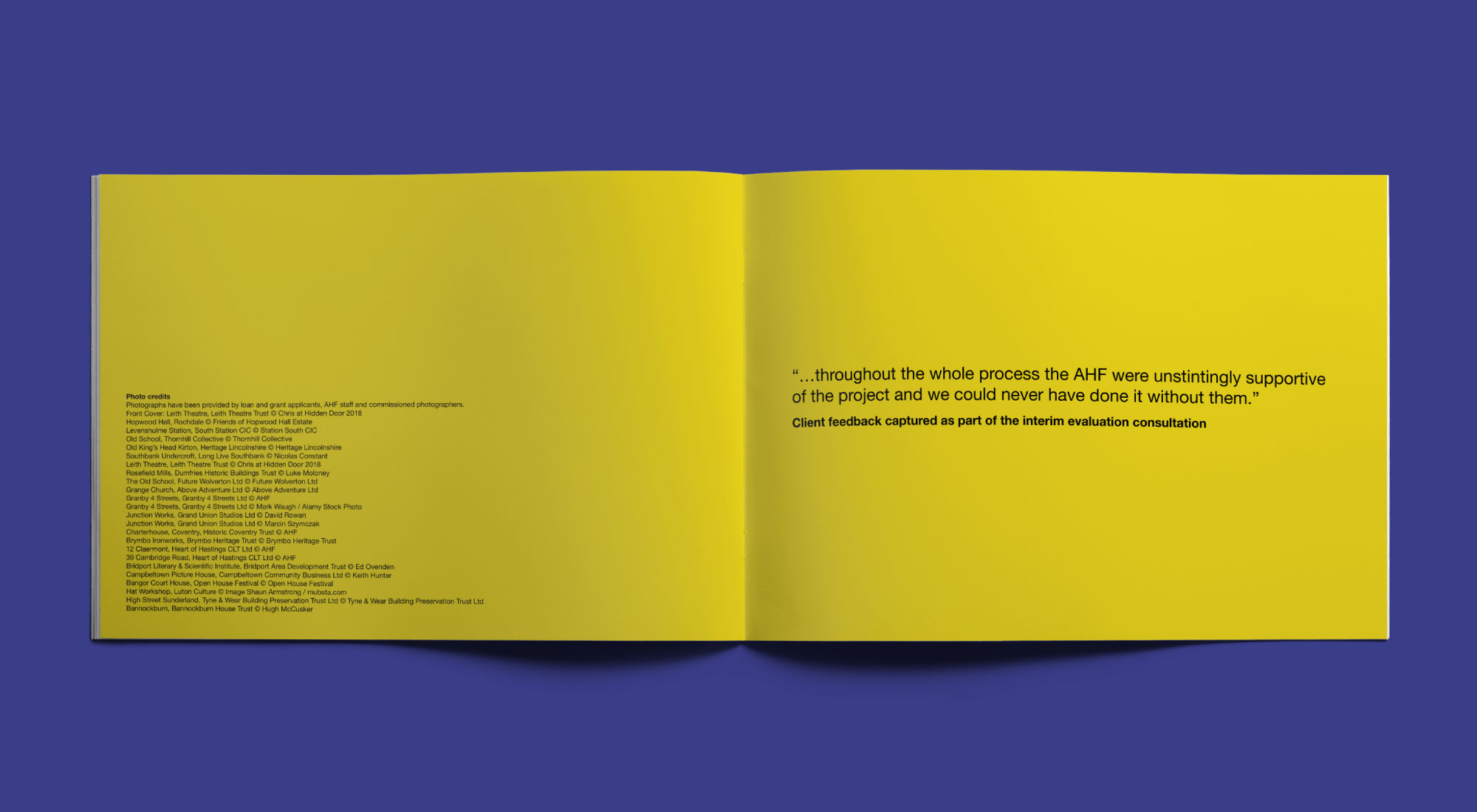
With a vibrant colour palette of yellow and red currently in place, we looked at adding a second colour palette. Selecting a palette of green, blue, brown and orange to outline the four main objectives. Once the colour palette was in place we moved onto looking at the typography.
Looking to create a cohesive look, we used a modern sans serif for both the headings and the body copy. Particularly matching the typography to the brand logo. Therefore gives this review a cohesive look that matches all brand touchpoints.