Heath and wellbeing newsletters for the workplace
Manchester Stress Institute
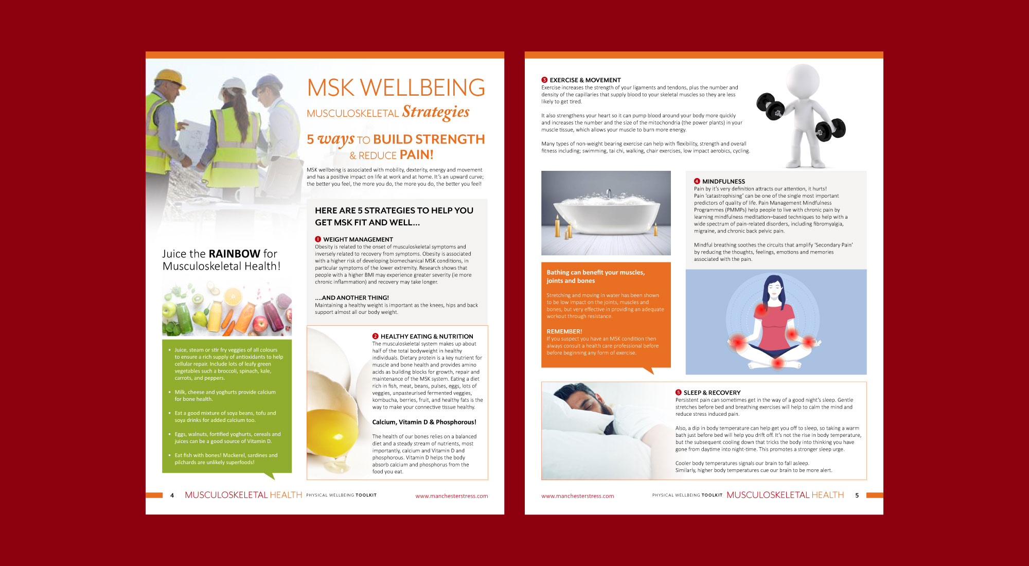
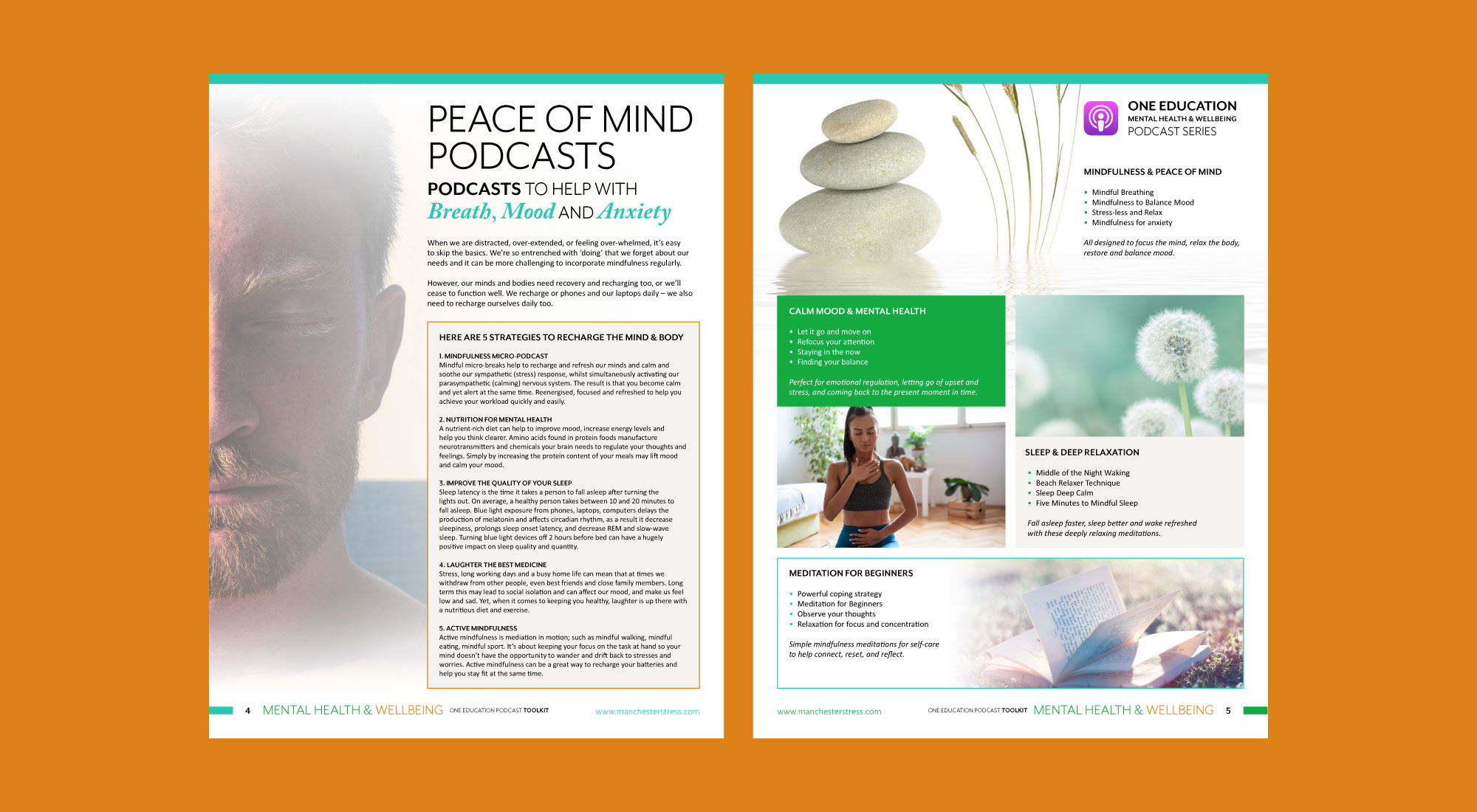
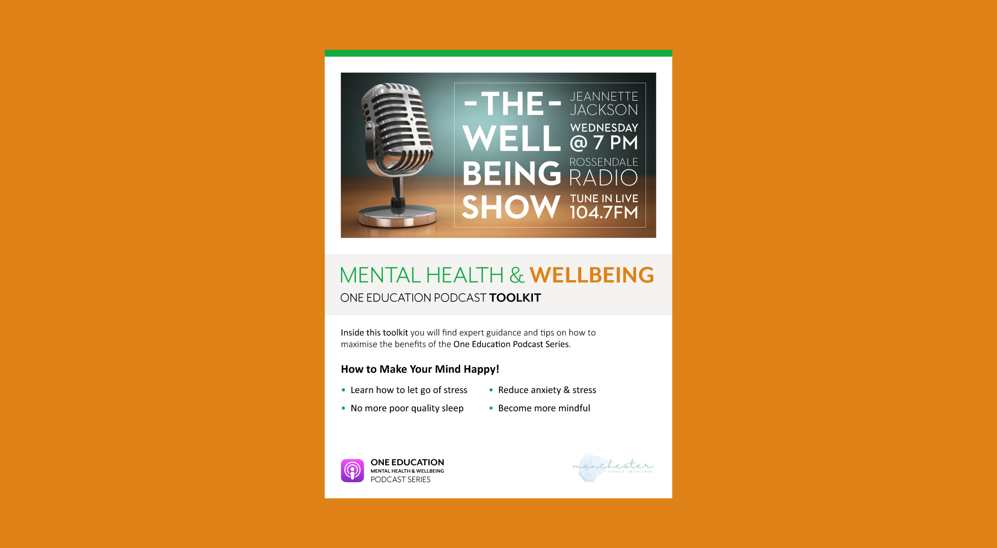
We were approached by Manchester Stress Institute (MSI) to design a set of newsletters that was predominantly editorial design based that could be sent out to staff within the work place.
The newsletters are aimed at improving the mental, physical and emotional wellbeing of staff within the work place through editorial design and digital content.
MSI are experts in staff health and wellbeing, providing health and wellbeing workshops, seminars and digital online training to organisations throughout Europe.
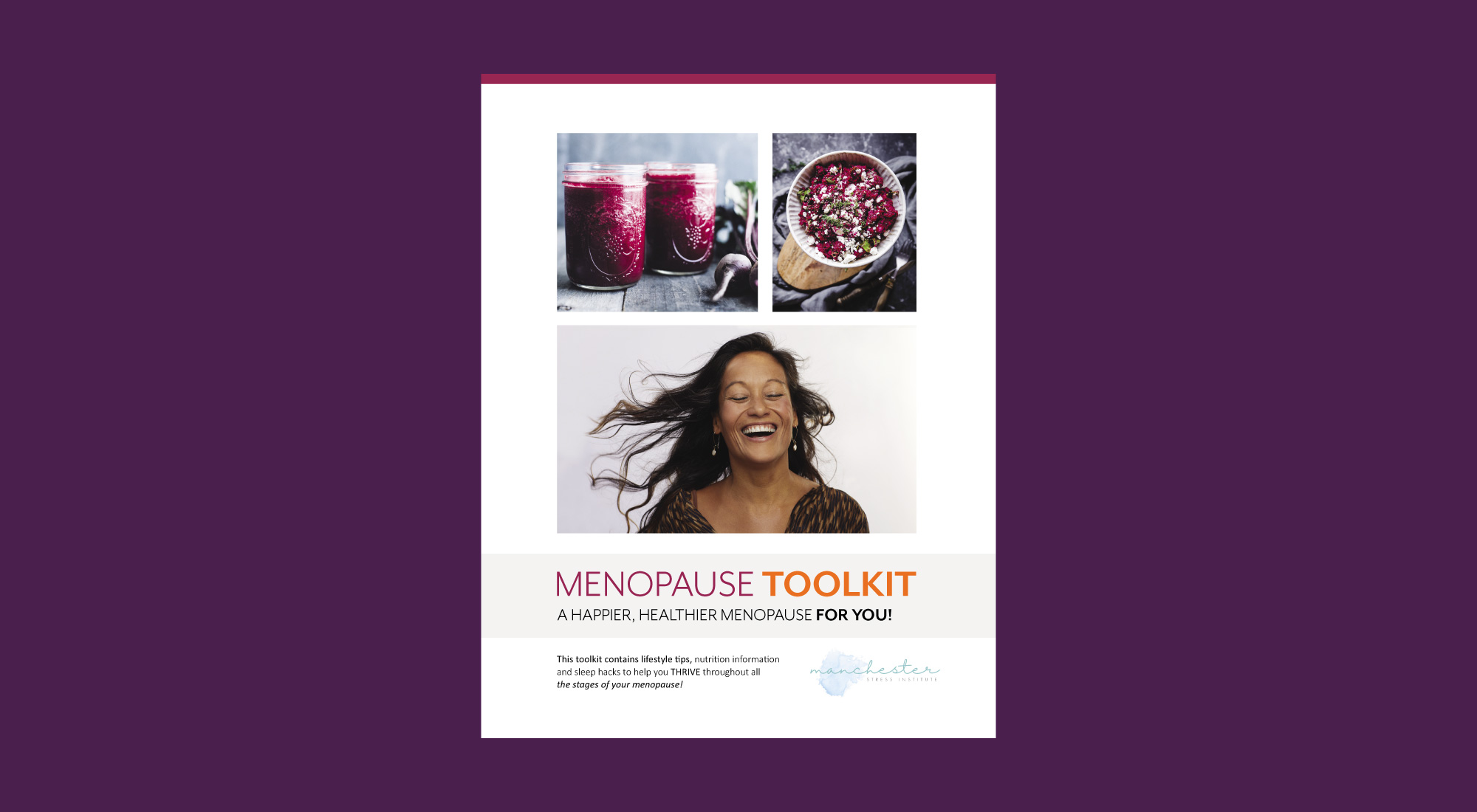
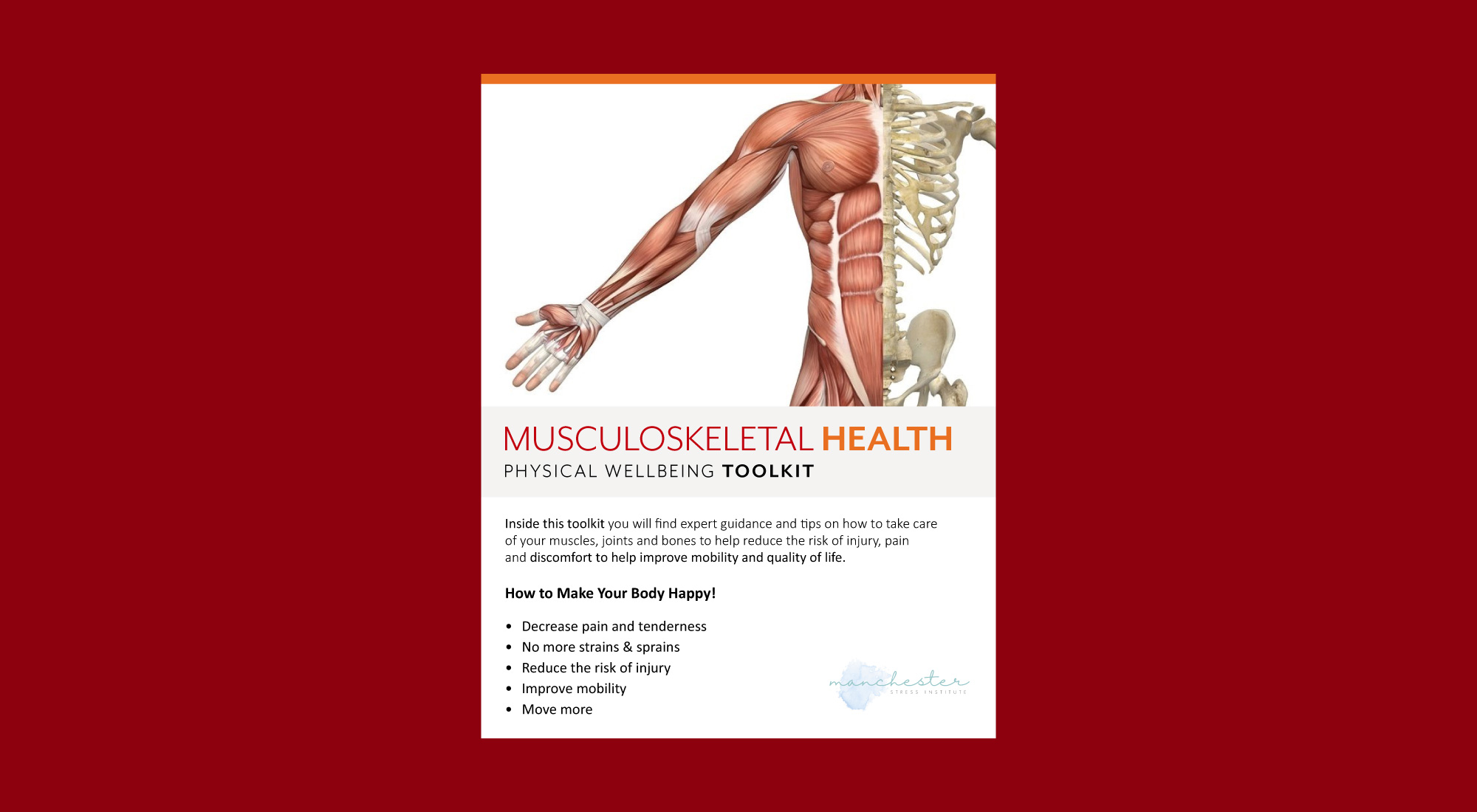
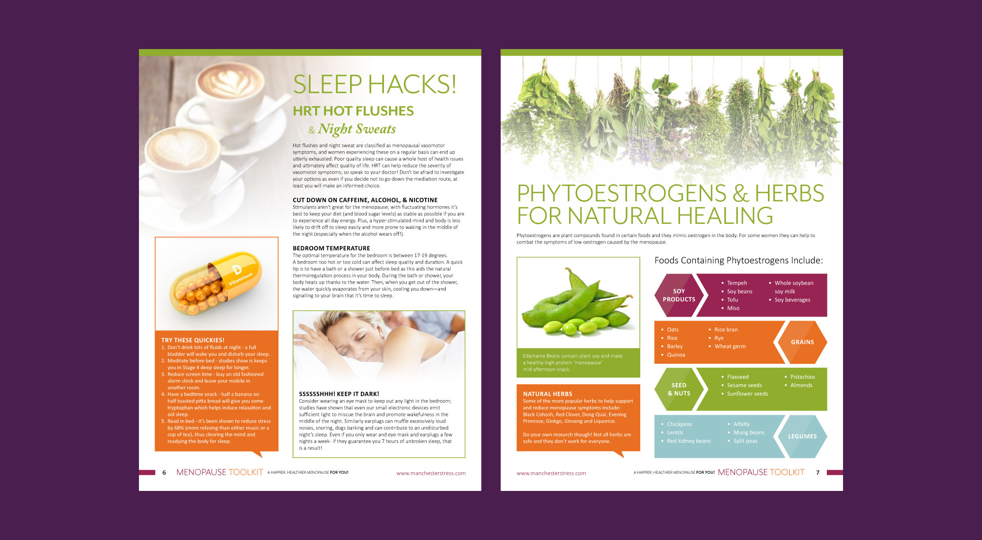
We we received a brief from the team at MSI to design editorial style newsletters. Every newsletter would be based on and around one main health issue. Topics that would include the menopause, musculoskeletal health, men’s health, high protein snacks and mental health and wellbeing.
Designing layouts that communicates a message
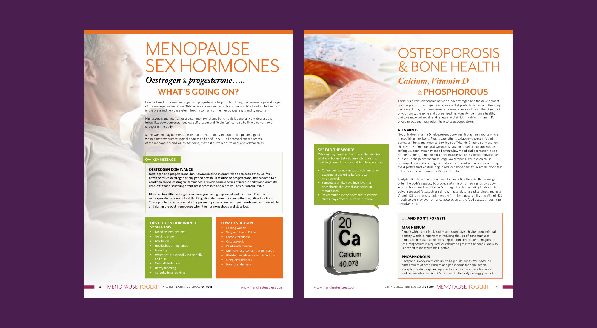
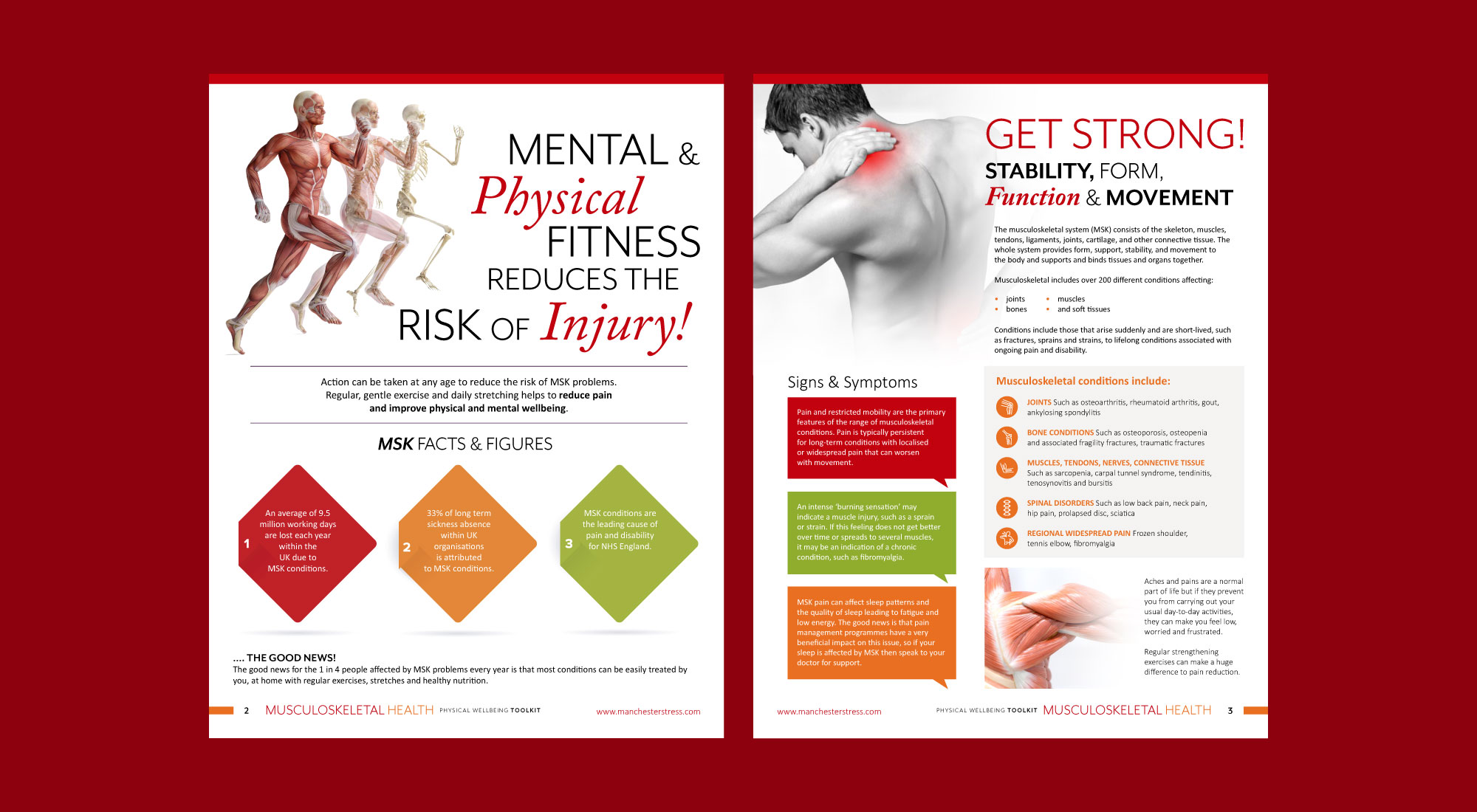
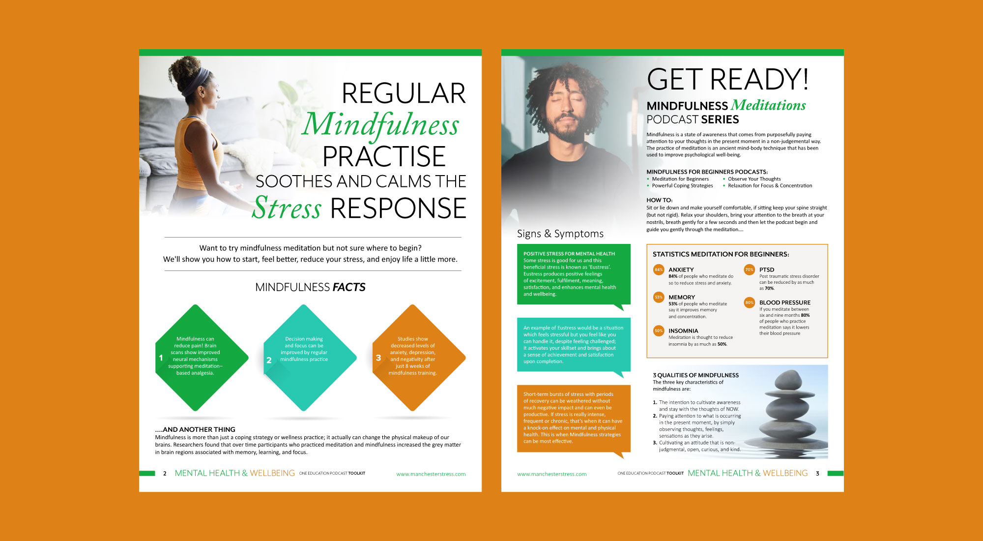
The content would contain facts and figures, statistics, key messages and advice all based around the selected health issue. The brief stated that the target audience would be workers within the work place.
Therefore we looked at how we could create the newsletters to be as easy reading as possible. Specifically looking at creating a layout that would appeal to workers of between 16 – 64.
With such a wide age range we found that the page design needed to be mainly visual. Keeping it fun to read while conveying important information.
“The newsletters you’ve done for me look amazing – everyone always comments on them.”
JEANNETTE JACKSON – MANCHESTER STRESS INSTITUTE
We kicked the project off by creating a template that would allow the editorial to be broken down into sections. Particularly creating sections of easy to read bite size content. This would allow each page to as visual as possible without been too text heavy.
Selecting a typeface that would be easy to read
Once the template was set we moved on to selecting the typography, opting for both a serif and a sans serif. This would keep the layouts flexible, using the fonts for both the headings and the body copy.
We placed important facts and figures into brightly coloured boxes, giving them a better chance of been read. Moving onto colour, we decided to choose a new palette for each newsletter. Specifically picking the colour palette based on the theme of the newsletter.
Project services
Graphic Design
Print Design
Layout Design
Related projects
If you like what you see let’s work together.