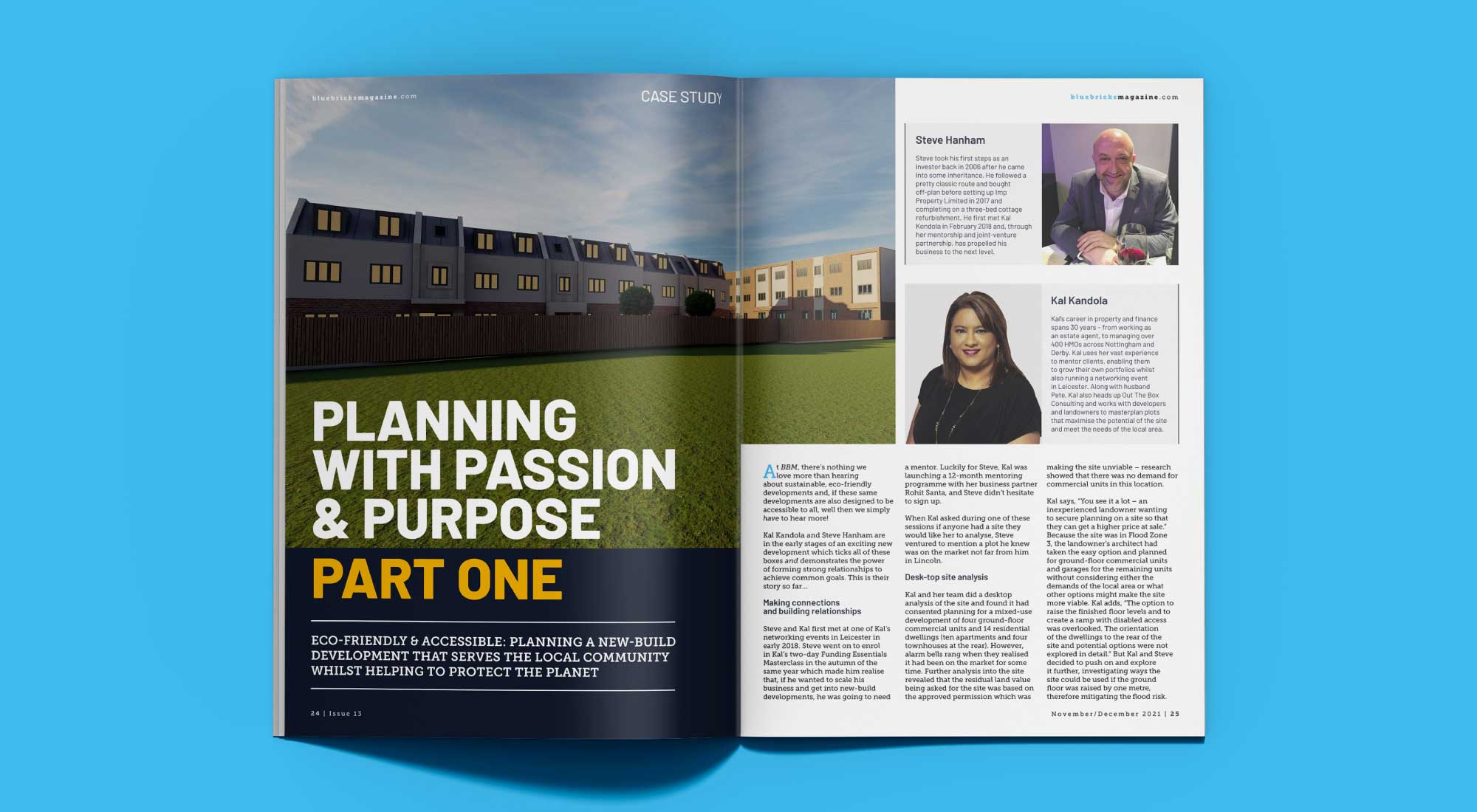
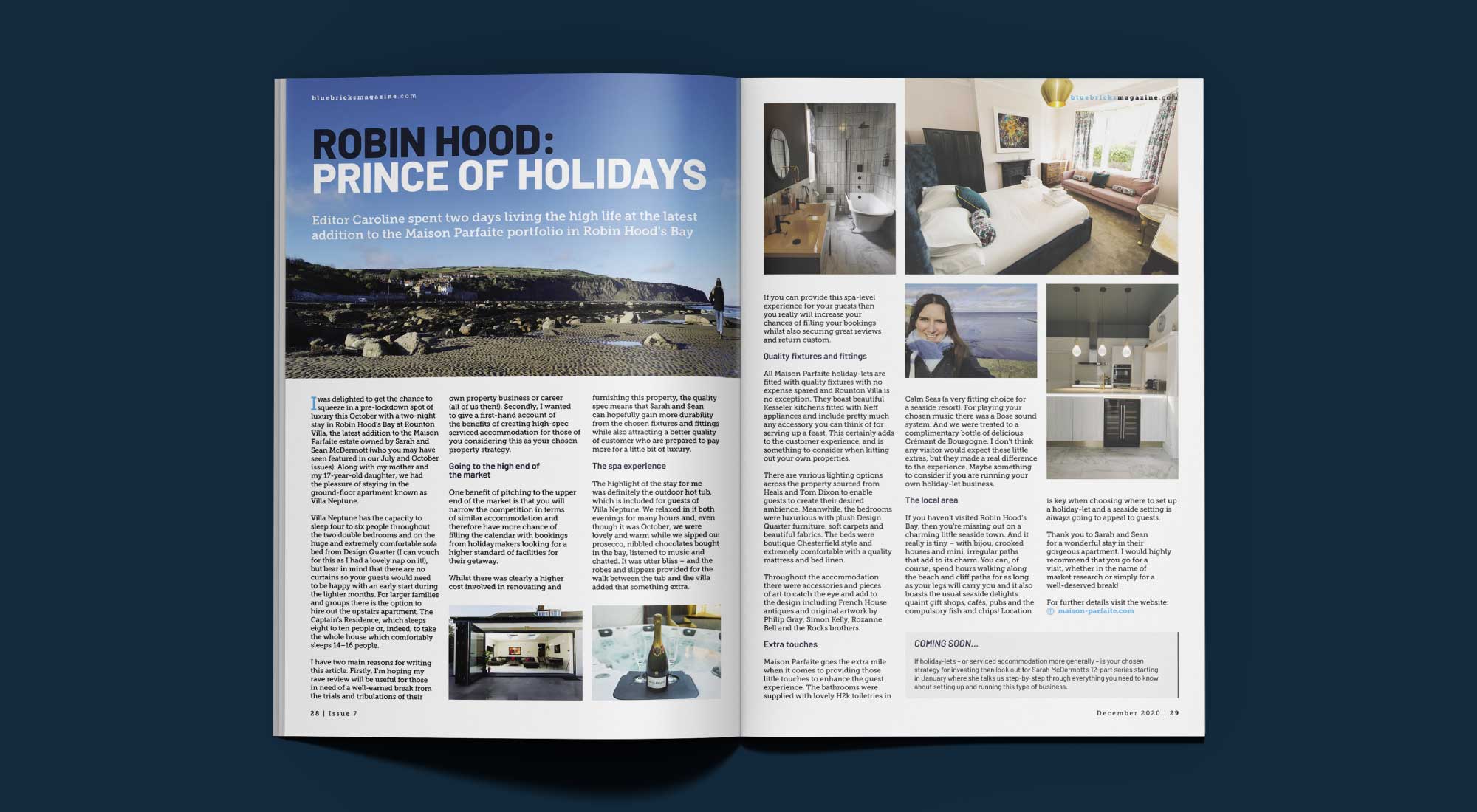
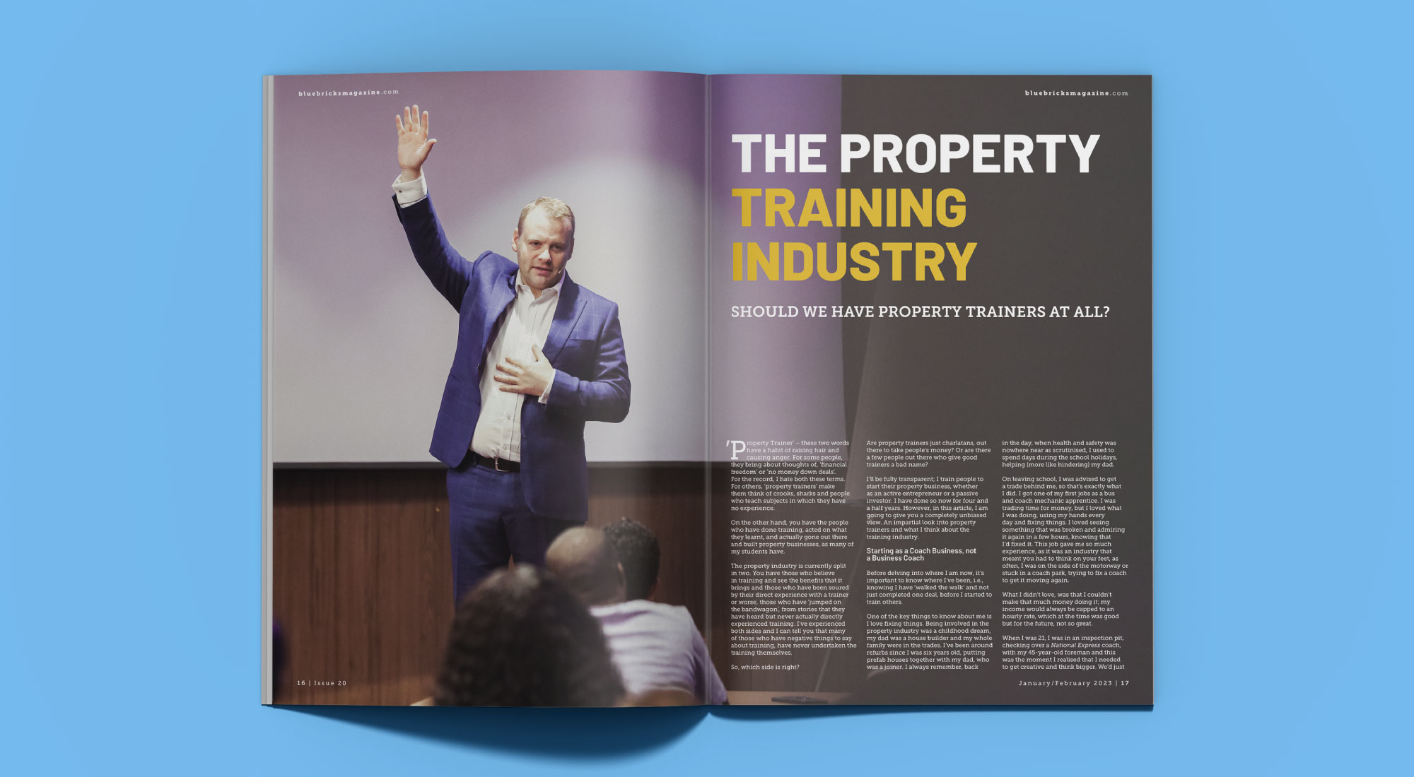
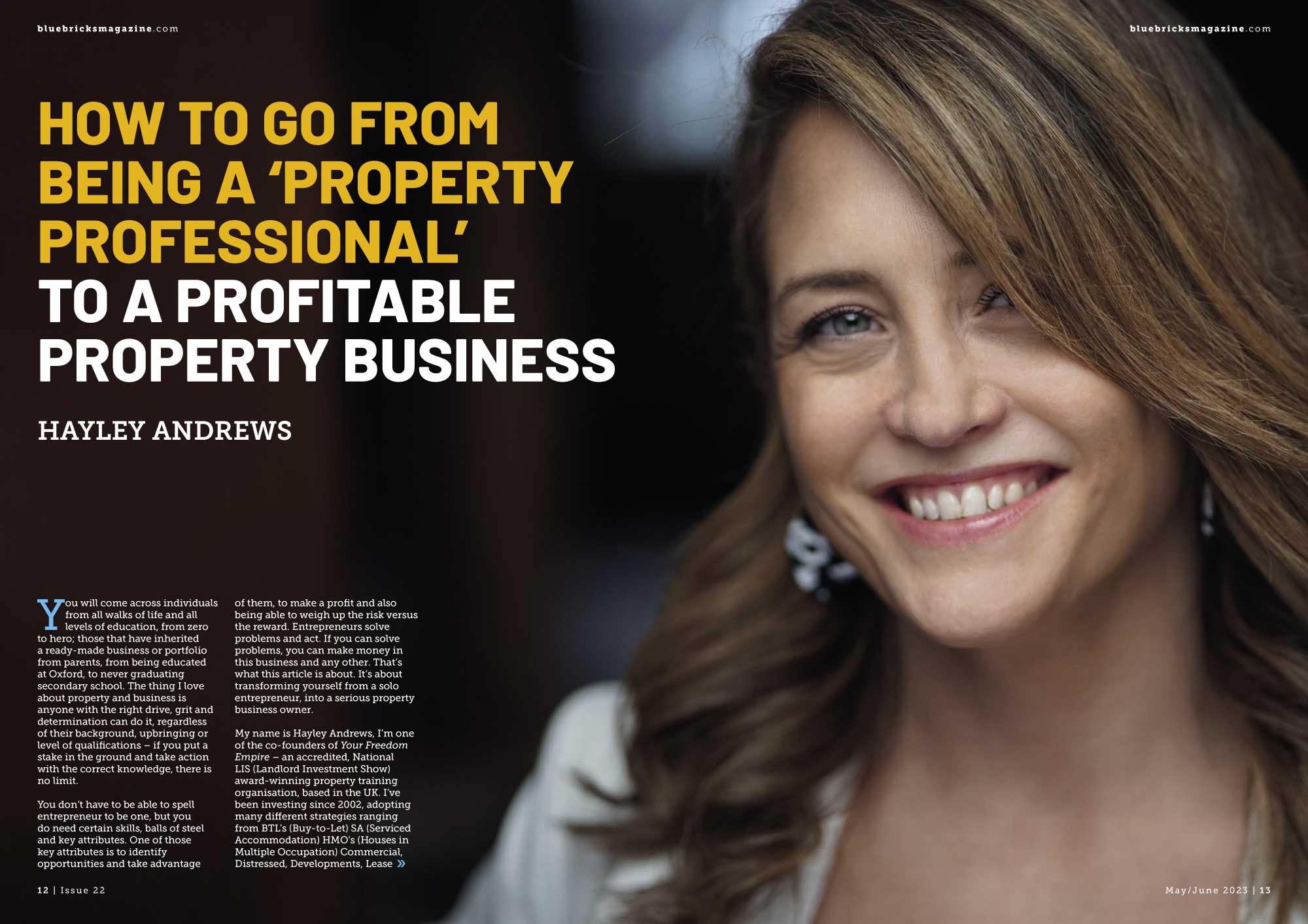
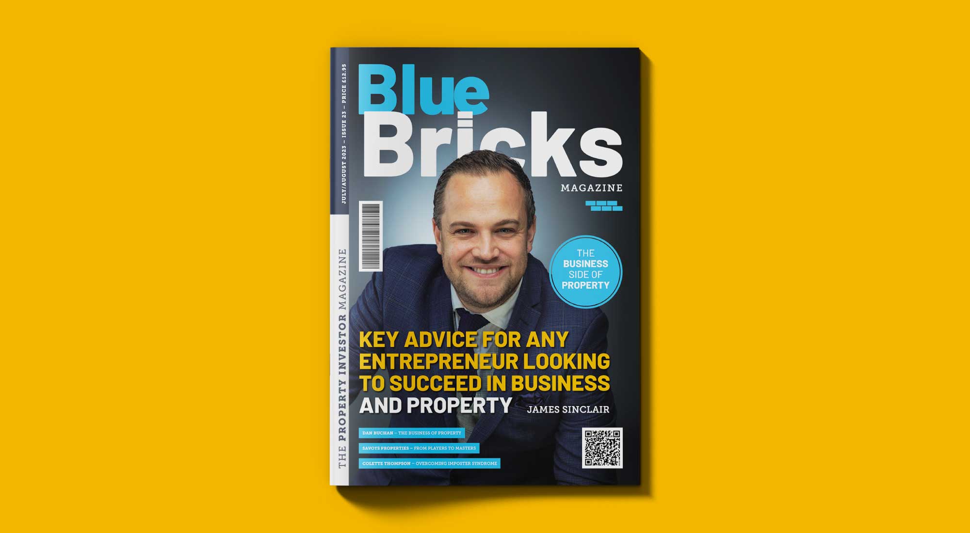
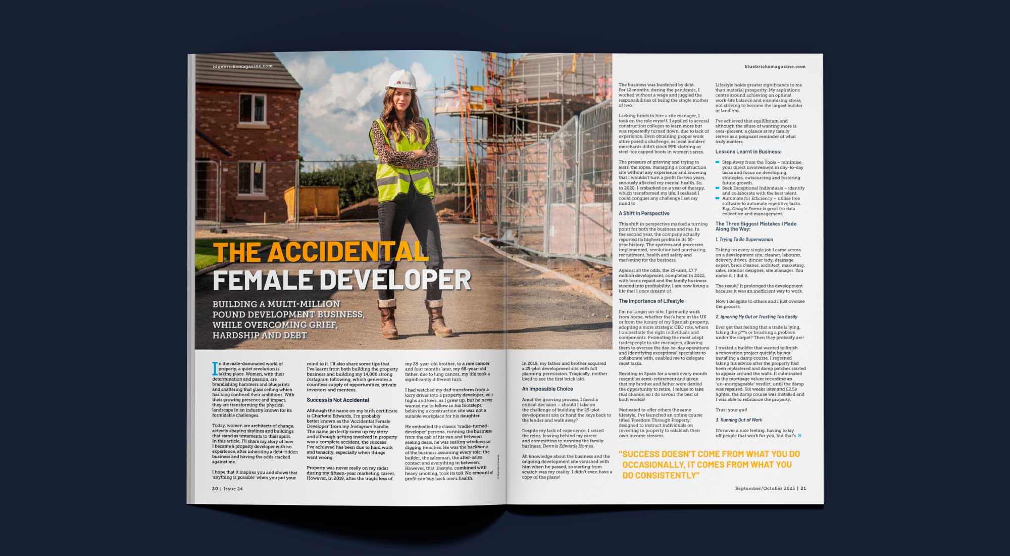
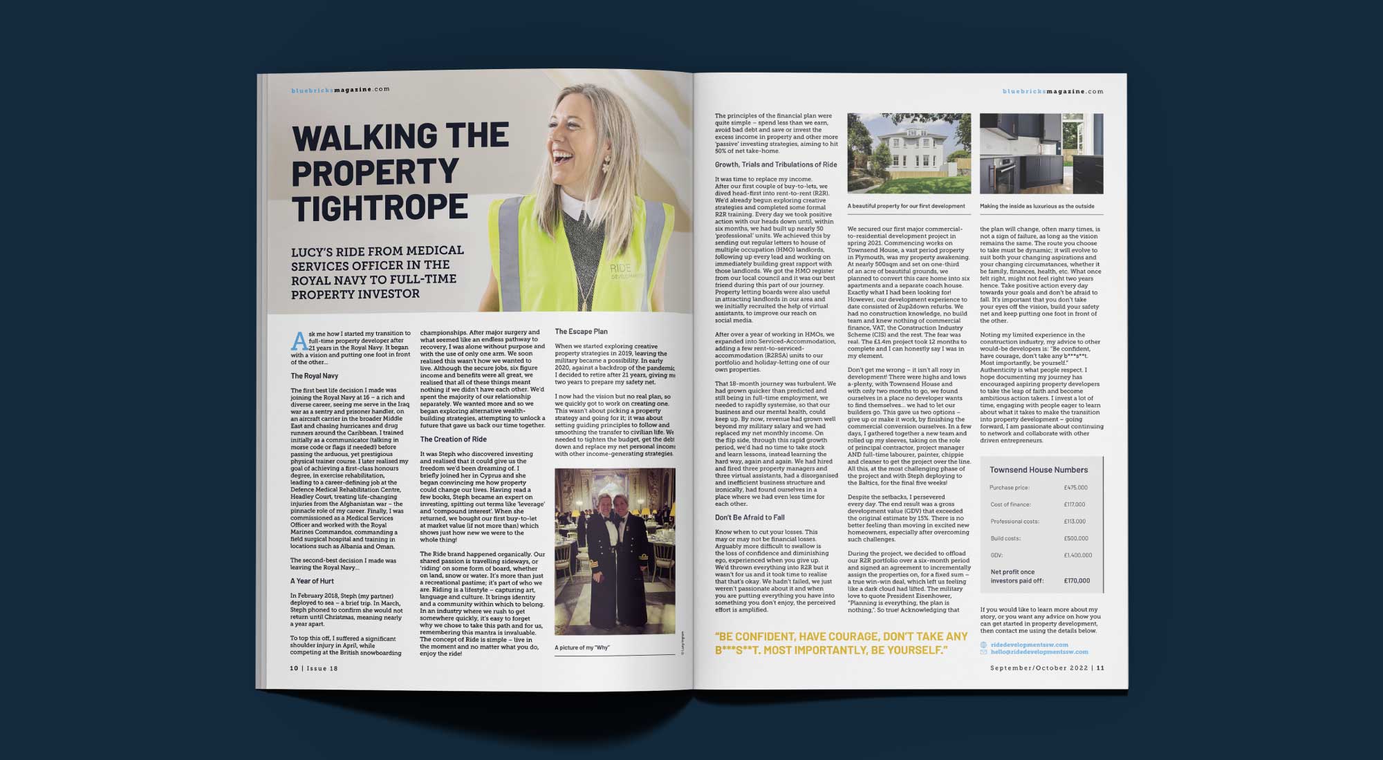
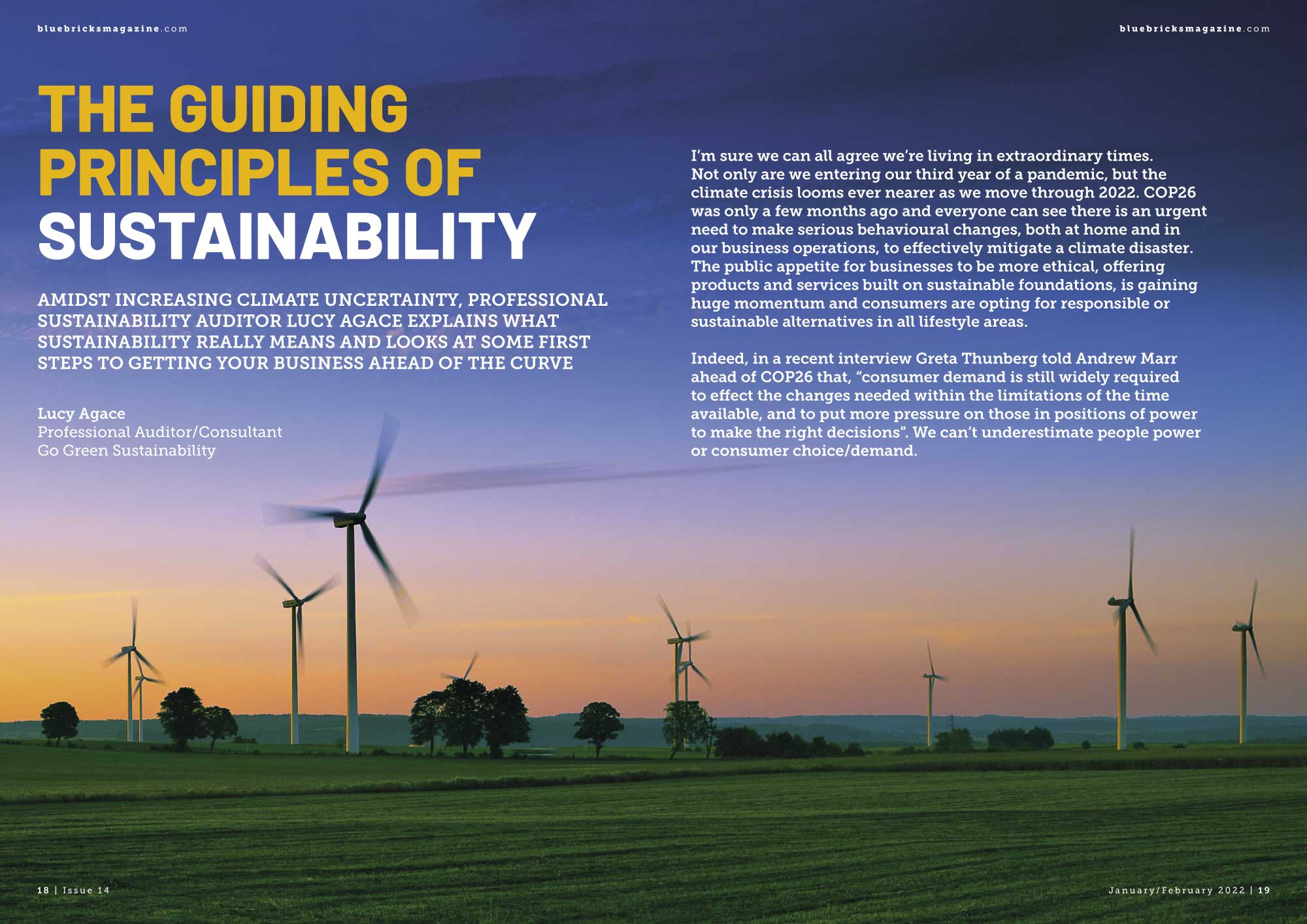
The colour palette is made up of complementary hues, selecting dark blue, light blue and mustard yellow. Setting the main headings in mustard yellow against a dark blue background.
We based the overall design of the magazine on a 12 column grid. Having both two and three text columns, this allowed us to create a variation in layouts for each issue.
Editorial design layouts crafted to engage and inspire the readership
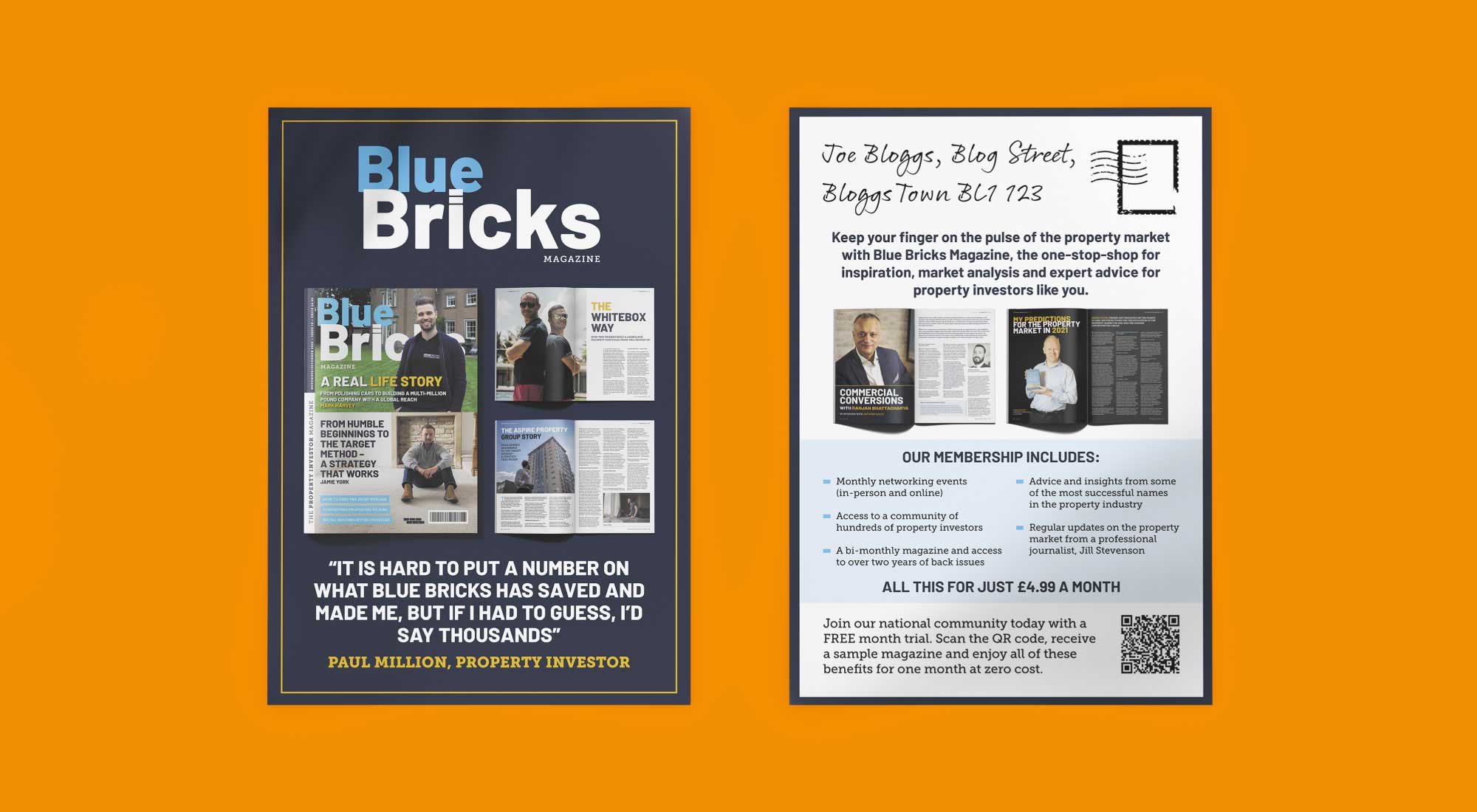
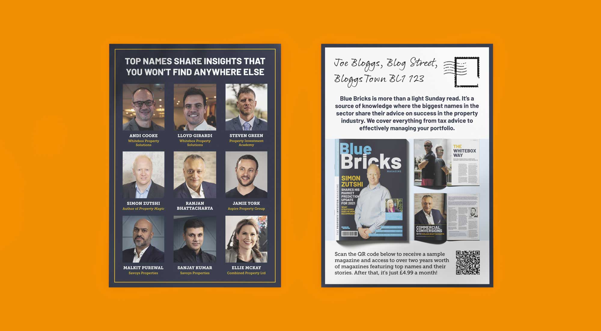
Once the design of the magazine was finalised, we were tasked with creating promotional marketing materials. Consisting of double-sided flyers and advertisements, the brief was to attract new clients to sign up to the membership. With the emphasis particularly being on how much value you can receive by signing up.
We are a graphic design studio based in Huddersfield, West Yorkshire that specialises in magazine design. Please feel free to get in touch via our contact page. We’d love to hear about your business and are always happy to help.
