We kicked the design process off by looking at how we could incorporate large amounts of copy into the layout. Particularly aiming for a very visual look, opposed to having text heavy pages like a regular book.
Creating a layout that emphasises the imagery
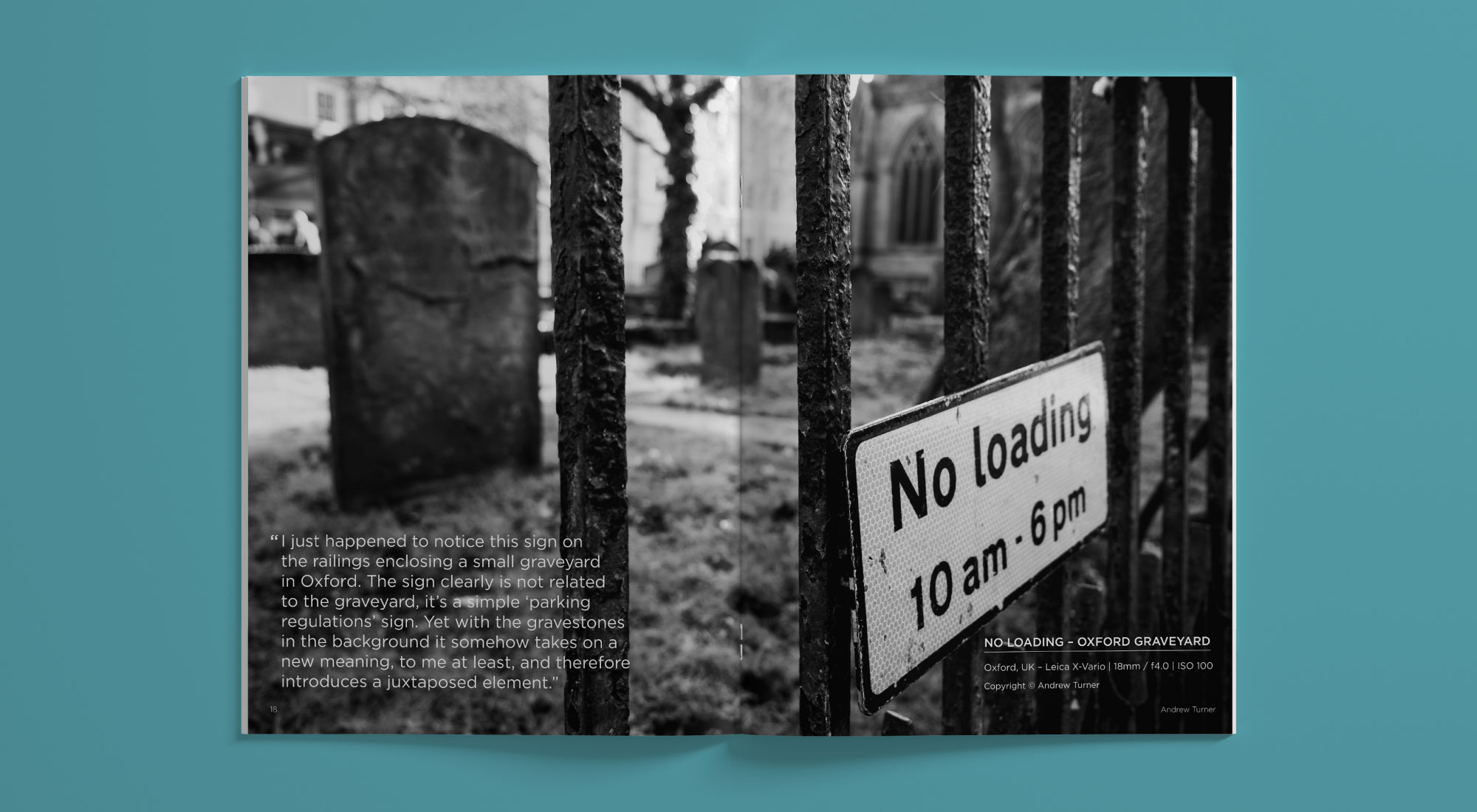
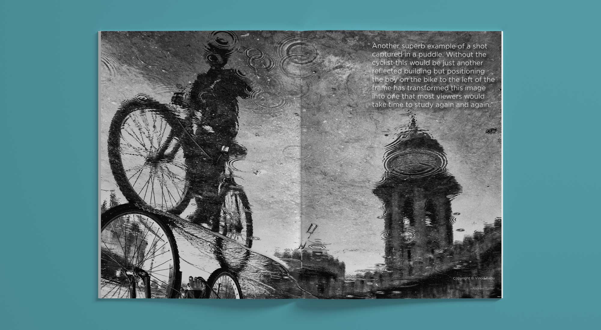
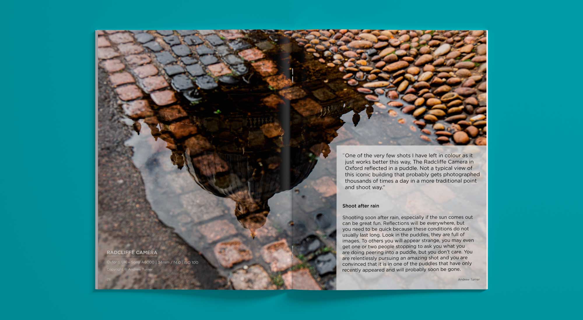
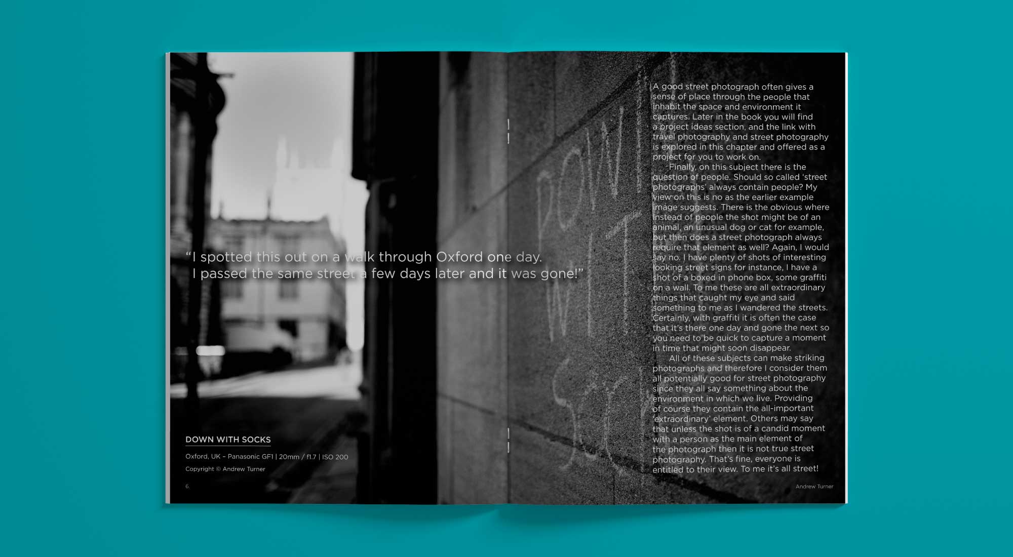
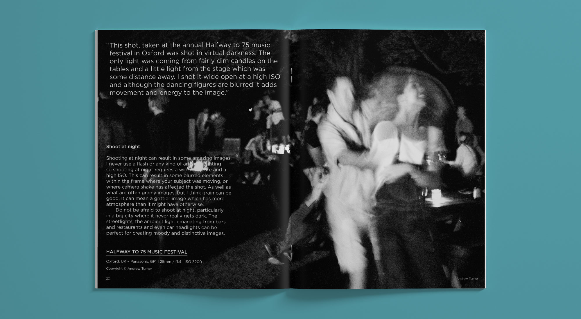
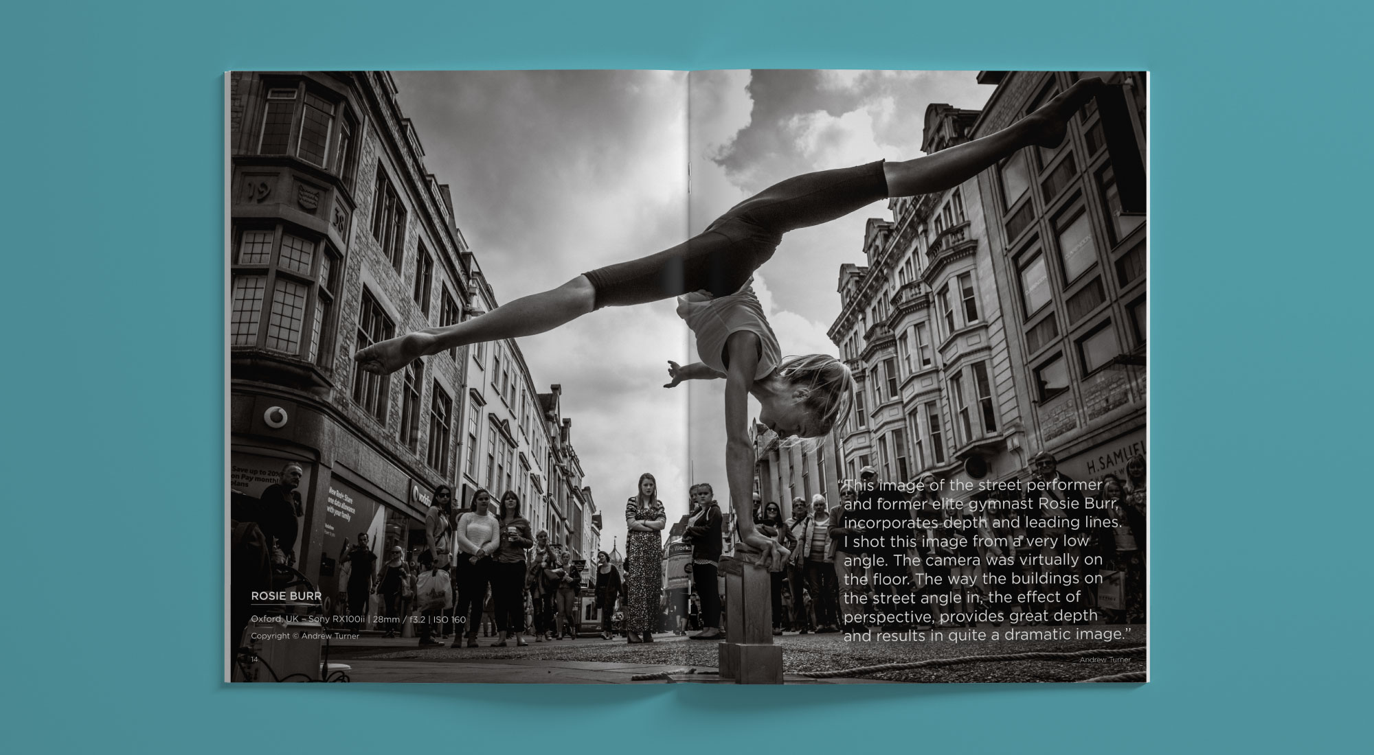
Making sure we made the most of the beautiful photography to break the copy up into smaller sized sections. Choosing to place each image on a double-page spread, incorporating either sections of run-on-text or a pull quote. To give the e-book design a contemporary look, we chose an easy reading sans-serif font.
Using the font for both the headings and the body copy. We chose to place the body copy into a single column template, specifically setup for reading on a digital device. Therefore perfect for reading the e-book on-the-go or in the comfort of your own home.